Podcast: Play in new window | Download
Subscribe: Google Podcasts | Spotify | TuneIn | RSS
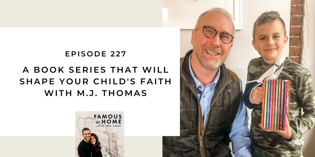
If you’ve found it difficult to get your kids to read the Bible, pay attention to you as you read it, or keep them engaged in learning about the faith, you will find great solace in this episode. Author and fellow Dad, M.J. Thomas is on this week’s episode to talk about his book series The Secret of the Hidden Scrolls and how it helps kids travel back in time and explore major events in the Bible. This book series is a household favorite in the Straub home!
Josh and M.J. talk about:
- The power of engaging stories to help the Bible come alive for kids.
- The inspiring story behind why M.J. Thomas decided to write The Secret of the Hidden Scrolls and how he was able to connect stories from the Bible to his real-life characters in the book series.
- Helpful ways to help your kids tangibly comprehend the meaning of the Bible.
Show Notes:
PURCHASE THE SECRET OF THE HIDDEN SCROLLS BOOK SERIES BOX SET AND GET ONE BOOK FOR FREE AND AUTOGRAPHED! Join Peter, Mary, and their dog Hank as they discover ancient scrolls and travel back in time to stories in the Bible.


Leave a Reply